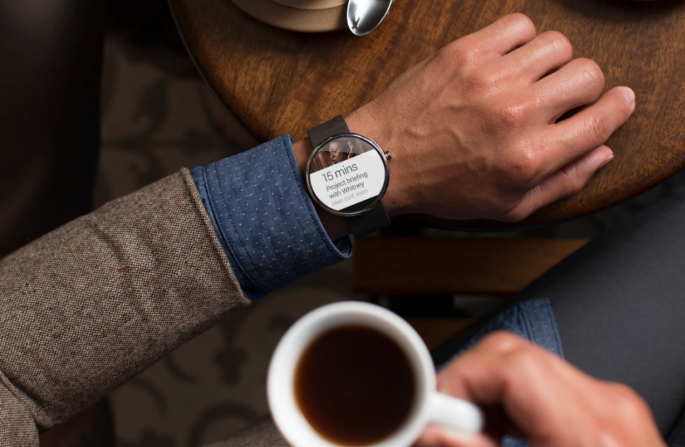
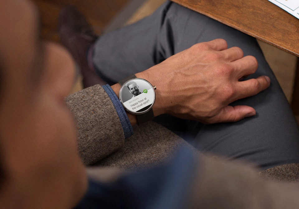
We love the Pebble Steel’s classier take on the smartwatch. More than anything, it gave us hope that even prettier wrist computers will find their way into the market soon. If the Moto 360 is any indication, that could be happening even sooner than we thought.
Sporting a round face and a whole load of style, it’s the first smartwatch that genuinely looks like a fashion accessory rather than a utilitarian computer, making for a fashionable replacement to your wrist candy of choice. Seriously, it looks more like a watch than a smartwatch, all while providing the functionality we expect from a wearable electronic device.
The Moto 360 sports the round face not just as a fashion choice. According to lead designer Jim Wicks during Motorola’s Google Hangout event, the round face enables it to have a larger surface area while remaining comfortable to wear, apart from being perfectly suited to the UI of Android Wear’s notification system. It will feature premium construction throughout (from the metal to the leather) and will likely be priced accordingly, which should position it as one of the more expensive smartwatches in the market when it launches.
There’s no camera, so the use-cases seem to be focused strictly on Android Wear’s core functions of notifications, voice commands, fitness tracking, and remote control. One notable omission is a microUSB port (a decision that seemed to help the overall design), which means charging is going to be done through one of the wireless protocols available. It will work with all Android phones running 4.3 and higher.
Despite the Google Hangout press event, details really remain sparse about the Moto 360. Expect to find out more shortly before the watch debuts in the summer.


