Despite efforts from the biggest mobile companies, Pebble remains, arguably, the best smartwatch in the market. Sure, it’s not the prettiest nor the flashiest, but it does the job and does it right. That same efficiency in function appears to continue with Pebble Time, the company’s newest model.
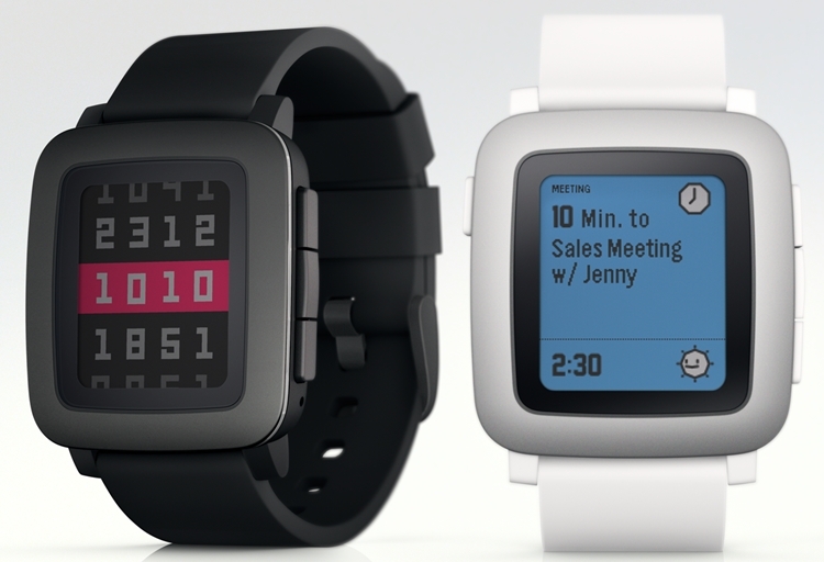
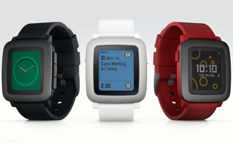
While still not the nicest-looking smartwatch, the design has definitely improved by leaps and bounds. Sure, it still feels geeky (any watch with a square face tends to feel that way), but the form factor is sleek enough that it’s actually very presentable (especially if a Steel version comes out down the line). It’s also 20% thinner than the original Pebble at 9.5 mm, a full millimeter slimmer than the highly-anticipated Apple Watch, aside from sporting a curved back that should fit wrists more comfortably.
The big update to Pebble Time, though, is the display. Instead of the grayscale panel of the first two models, the new wrist computer comes with a color e-paper display, so you’re no longer stuck with black and white interfaces. Because it still uses always-on e-paper, it retains the crown for industry-best battery life, allowing the watch to function for an entire week before requiring a recharge. It also retains the water resistance of the original, as well as compatibility with all existing apps and watch faces in the Pebble Store.
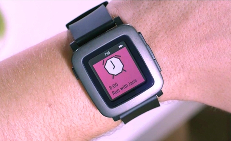
New features include a microphone for sending voice replies (or taking voice notes) and a quick-release pin for swapping standard 22mm watch bands in under 10 seconds. It also comes fitted with a new “timeline interface,” which lets you view notifications and events in a chronological manner. It’s accessed using the three buttons on the right edge, which correspond to past, present, and future, respectively.
Preorders for the Pebble Time are now ongoing on Kickstarter. Pledges to reserve a unit (May ship date) starts at $179.


